| OFFICES | FACILITY PLANNING |
JAY GEE HOUSE |
|
|
ISH |
Fragments of an UrbanScape 1.2 [ 08.1999 ] |
| B E Y O N D T H A T W I L L F U L C U R V E | |
|
Text Philip Brooks :: Photos Poole Associates |
|
|
|
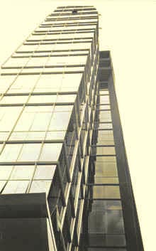
Shoehorned into an irregular site along MacPherson Road, amidst a dense collection of industrial premises, this sleek 12-storey office tower appears immediately distinct from its close neighbors, owed to its contemporary, uncluttered image. Hemmed in by adjacent buildings, such is the tightness of the site that you will experience a stiff neck taking in the tower from close quarters. But the demand for such a neck-defying act is actually forgivable since the overall form is clear and legible from ground level. Sure, you need to be some distance away to fully appreciate the exterior proportioning, but zoomed-in inspection offers a glimpse of LST's approach to building in such a confined space. Put simply, the clean straightforward verticality of the block permits a comprehensive reading of the relatively sheer flanks, almost at a glance. While several materials finish the exterior, interfaces are executed neatly with the palette of glass, metal cladding, and spray coated plaster being restrained throughout. The basic language is even extended to the substation and boundary wall detailing. The full-height sectional curve which adorns the facade edge, visible from the site entry, is the project's most willful formal gesture - the most apparent "signature" device. The curve, commendable for its graceful sweep if nothing else, gives a dynamic significance to the overall form. At a closer range , a fine degree of subtlety is displayed in the careful, elegant modulation of the glazed curtain wall, with its distinctively profiled sections. |
|
A brief look at the floor plans reveals an asymmetrical and compact arrangement around an approximately central core of lifts and services. The temptation to impose a geometrically "balanced" layout has been resisted, to the architects' credit. A knee-jerk symmetrical or centralized plan would have been irrelevant on such an odd-shaped site-sensitive architect. I recall a school tutor's maxim, attributed to some famous architect - "the more constraints a site has, the better the potential | architecture". ___________________________________________________ |
|
 |
|
|
|
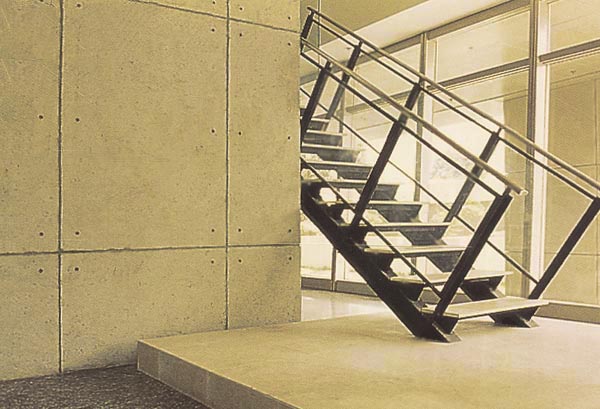
On approach to the entrance lobby, the compact footprint becomes increasingly noticeable. In fact, the place where you might expect to find the principle entrance is really [*gasp*] the loading and unloading bay and car park approach. That means, if you managed to get this far, you have already [*oops*] missed the main entrance, which is a very understated lobby marked by a crisply-detailed canopy. The scale of the lobby is small, but closer examination opens up an intriguing double-height space with overhead corridors criss-crossing the void, allowing partial glimpses of adjoining spaces. _ A somewhat funky staircase launches from, or touches down onto, [note; depending on travel direction] a concrete plinth, which is also effective as a platform that receives movement up the stairs. The space behind the stairs, inviting at first, turns out to be a dead end - "a nothing space"; thankfully free of "the invading potted-plants" that somehow find their way into any leftover but vaguely pleasing corners such as this. It is curious that precious GFA was apparently given over to provide the staircase some "breathing space" as it ascends | descends. The result [intentional or not] is as satisfying on that basis, just as it is puzzling in its unresolved-ness. ___________________________________________ - The writer is mistaken on several points: the "nothing space" leads to the most crucial room of the building - 'the staff training center'. The apparent giving up of GFA relates to the building as a warehouse with a pre-described maximum designated as usable office space. As for the premise of the curve of the facade - this is a direct product of putting the valuable GFA on the smallest number of office floors as possible, obviously at the top, for the views. Ultimately the interior space planning of the building and site constraints dictated the building form. > ePoole ___________________________________________ |
|
Moving on, beyond the "blink-and-you'll-miss-it" entrance foyer, through some truly vast stainless-steel doors, is the central lift lobby, its utilitarian functions dictated by the service risers and doorways clustered almost fully around the perimeter of each lobby [ on every floor ]. There could easily have been a temptation to "jazz up" the no nonsense lobbies, thankfully averted here. The stainless finishes denote rugged heavy-duty usage while still suggesting quality and "style". elevating [*sorry..*] the tiny space beyond "service lobby" status. Arrival at Jay Gee's office in the top-floor penthouse is announced by yet another set of humongous fire-rated stainless steel doors [testing those for PSB certification must have been an interesting event]. The restraint already witnesses on the exterior and in the public areas of the tower continues with a discreet change of tone in the office space. One is spared a formal reception area or intimidating corridors - thanks to the layout being organized around the central core. Designed by Ed Poole and Andrew Jones, better known for their flamboyant designs for pubs and restaurants, the initial feel of the office interior is one of informality. But a strong sense of control was felt gradually - Poole responding through the interior spaces to that all-pervading "restraint" in the architecture. ___________________________________________________ |
|
|
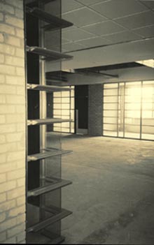
A key characteristic of this space is its connection with the external expression of the building; the attention given to the curtain wall internal profiles is impressive, and displays an integrity between exterior and interior architecture. This outside | inside harmony is amplified further by very cool skylights, which transform a potentially banal and dimensionally modest space into something sensuous, precious and special. [Disclaimer : our discussion refers to sensory and tectonic issues; outside | inside interactivity in tropical climatic contexts has been discussed at length elsewhere]. The raw state of internal finishes, or the unfinished look, if you like ie exposed RC structures, gray bricks, cement-plaster masquerading as off-form concrete [and very easily getting away with it] and those stainless doors should last well and require minimal maintenance. And it looks good too. Particularly interesting are the light fittings amongst an exposed M+E installation. Although some of the materials used are simple and inexpensive [cheap would be the wrong word], the overall impression is one of functional and uncluttered, and more simply, attractive quality. In lesser hands, this office might have been just another timber-veneered | glossy-laminated | false-ceilinged | plush-carpeted corporate suite complete with token designer pieces and spotty downlights. It is greatly refreshing then [and a bit exciting], to see a corporate HQ asserting an image of "truth to materials". In the profit-driven world of corporate commerce it is A GOOD THING to find evocative AND functional interior spaces that successfully present a particular "workplace" identity, yet through appropriate references to the external envelope, keep very firmly in touch with the outer self. |
 |
| next page | home |
|
Architect Interior Designers | Planners Civil + Structural Engineers M+E Engineering Quantity Surveyor Main Contractor | Jay Gee House 10 Genting Lane #11.00 Singapore 349583 |
Lee Sian Teck Architects Poole Associates Private Limited Buro Engineering Pte Ltd JM Pang & Seah Pte Ltd BKP Associates Pte Ltd Aoki Corporation |


